

UI Icon Framework for Wearable & Mobile Interfaces
A modular icon framework designed to support wearable and mobile application interfaces under strict size, contrast, and legibility constraints. The system focuses on consistent stroke weight, optical balance, and predictable alignment to ensure clarity at small scales and reliable implementation across device types. Icons were constructed on a shared grid and validated in context within dark and light UI environments to support fast engineering handoff and reuse across multiple interface surfaces. The framework emphasizes functional clarity and system consistency over decorative detail, making it suitable for evolving applications with minimal design overhead.

Design Goals
• Ensure legibility at small sizes, especially on wearable displays.
• Maintain visual consistency across navigation, states, and device types.
• Create a system, not individual icons, that scales across products.
• Support engineering efficiency through predictable geometry and rules.
• Maintain visual consistency across navigation, states, and device types.
• Create a system, not individual icons, that scales across products.
• Support engineering efficiency through predictable geometry and rules.
System Rules
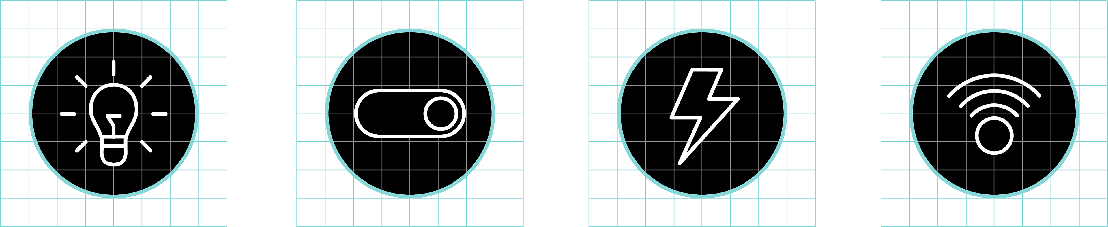
• Grid: 24×24 base grid.
• Stroke: Single, consistent stroke weight across all icons.
• Corner logic: Unified radius and terminal treatment.
• Optical alignment: Icons balanced optically, not mathematically.
• Style: Outline icons optimized for dark and light UI contexts.
• Stroke: Single, consistent stroke weight across all icons.
• Corner logic: Unified radius and terminal treatment.
• Optical alignment: Icons balanced optically, not mathematically.
• Style: Outline icons optimized for dark and light UI contexts.
Wearable & Device Interface Icons
A functional icon system designed to support wearable and mobile interfaces for smart-home and device control. The system prioritizes clarity at small sizes, consistent stroke logic, and predictable alignment to support fast engineering handoff and reliable reuse across platforms. Icons were designed as part of a broader UI framework and validated in context across watch and mobile surfaces.


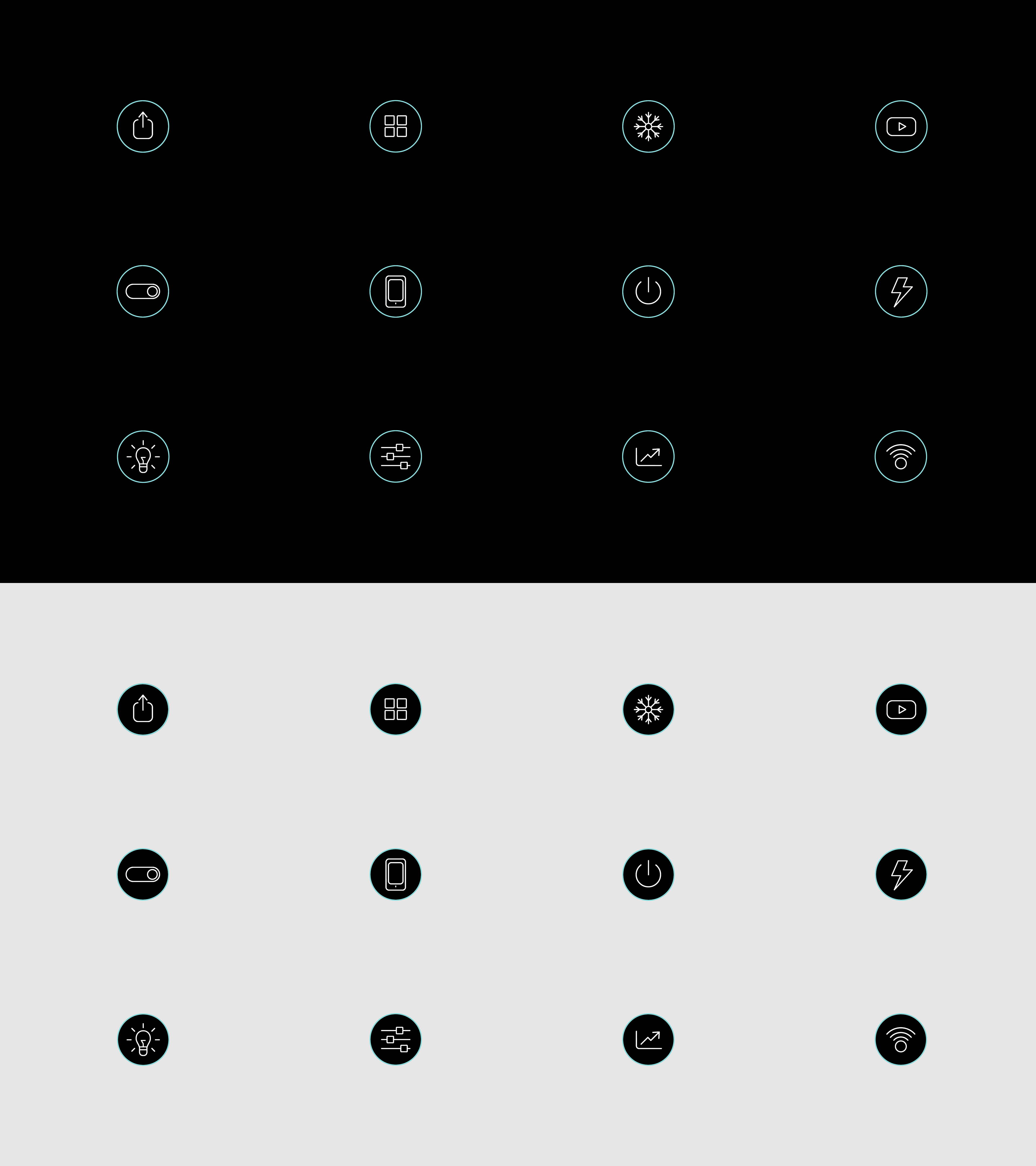
This system demonstrates an operator-level approach to icon design: defining constraints, building reusable logic, and validating work inside real interfaces. The focus is on clarity, scalability, and handoff readiness—not decoration.