NRG Vivint
Smart Home Energy Wearable Interface
Smart Home Energy Wearable Interface
Concept work created to explore how core smart-home controls and energy insights could be surfaced on a wearable interface when production work cannot be shared. The goal was to design a glanceable, low-friction experience optimized for Apple Watch constraints—limited screen size, short interaction windows, and high-frequency status checks. Focus areas included energy visibility, device control, and fast state confirmation with minimal navigation depth.
Design Focus
• Glanceable energy metrics optimized for short interaction windows.
• Fast access to high-priority controls (lights, climate, devices).
• Clear active/inactive state visibility.
• Minimal navigation depth to reduce cognitive load.
• Predictable layouts to support muscle memory on small screens.
The challenge
Smart home platforms offer powerful controls, but most energy insights and device management live in mobile or web apps that are not optimized for quick, on-the-go interactions.
On wearables, users need:
• Immediate status awareness.
• Clear on/off confirmation.
• Fast access to critical controls without deep navigation.
The challenge was to reduce complexity while preserving meaningful control.
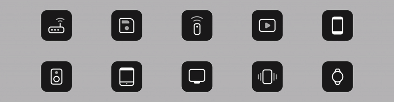
Icon and motion system
Icons were designed as part of a shared UI framework to ensure:
• Consistent stroke weight and visual rhythm.
• Legibility at small sizes.
• Predictable behavior across states and surfaces.
Subtle motion is used to:
• Reinforce state changes
• Provide feedback without distraction
• Maintain clarity in low-attention contexts
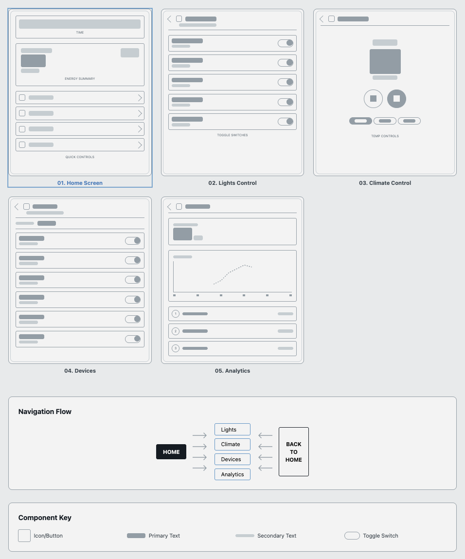
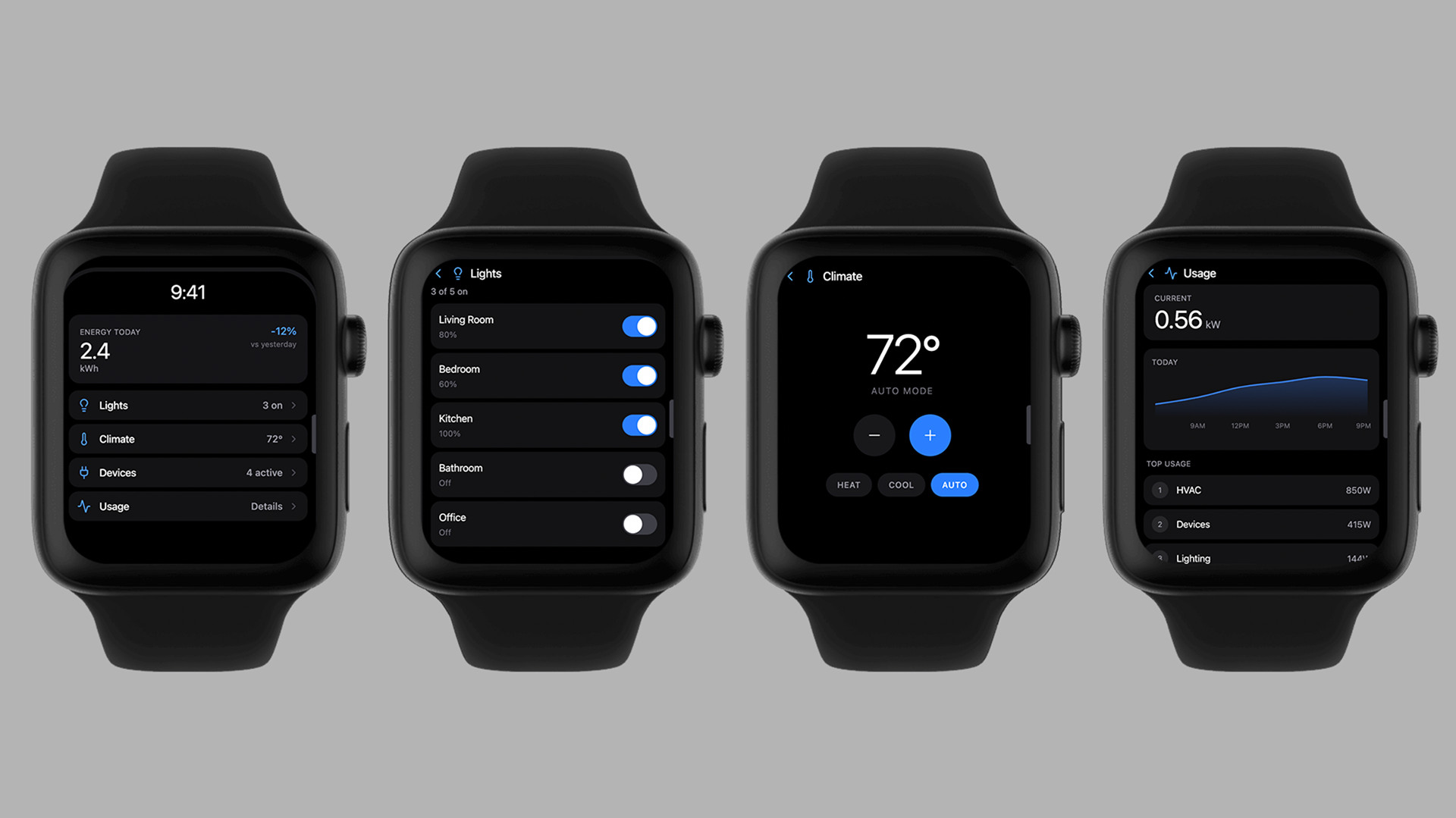
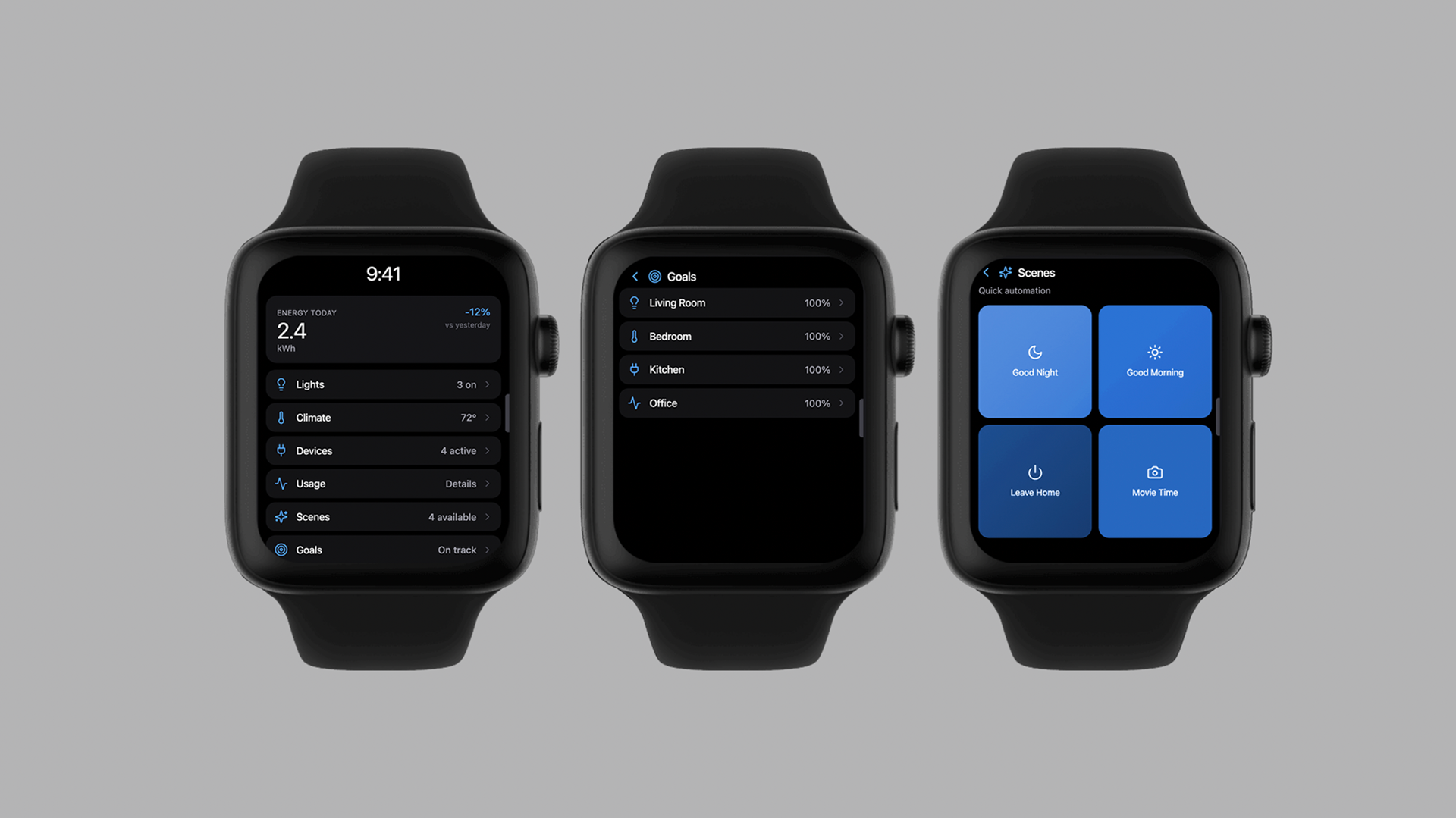
01. Home Screen Purpose
Primary entry point designed to surface the most important information at a glance. UX considerations Energy summary placed at the top to establish context immediately Quick controls prioritized over secondary navigation Each row functions as both a status indicator and navigation entry Key behaviors Tap → drill into detailed control State indicators visible without interaction.
02. Lights Control Purpose
Enable fast room-level lighting control without opening a mobile app. UX considerations Toggle-first interaction model for speed Room names prioritized over icons to reduce ambiguity Active states clearly differentiated for quick confirmation Key behaviors Toggle updates state immediately Scroll supports additional rooms without changing hierarchy.
03. Climate Control Purpose
Provide fast temperature adjustments while preventing accidental changes. UX considerations Large temperature readout for legibility Increment/decrement controls sized for touch accuracy Mode selection (Heat / Cool / Auto) separated to reduce errors Key behaviors Immediate feedback on temperature changes Mode state always visible.
04. Devices Purpose
Offer quick visibility and control of connected devices. UX considerations Device list prioritized by activity status Power state visible without opening individual controls Consistent toggle placement to support scanning Key behaviors Toggle controls power state Scroll accommodates additional devices.
05. Analytics / Usage Purpose
Surface lightweight energy trends without overwhelming the interface. UX considerations Trend visualization simplified for small screens “Top usage” prioritizes actionable insight over raw data Chart supports recognition, not analysis Key behaviors Scroll reveals additional breakdowns Designed to complement, not replace, mobile analytics.